electric vehicle
console ui
category
UI/UX Design
Icon Design
director
Avery Caldwell
year
2022
project summary
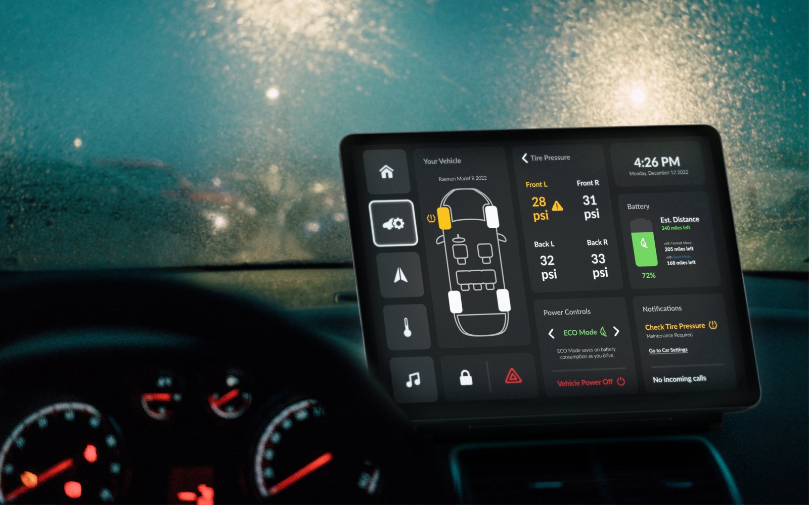
Car UIs are known to be lacking or difficult to use, as many do not prioritize a good UI since car companies are NOT digital technology companies. These car “infotainment” systems, have so much crammed into them, making them even more complicated to navigate through. Not only does this pose a mental headache for drivers, but it is also a major safety risk.
My solution is a simple-to-use interface that reduces the number of times a user needs to click to get to a setting they want to control. This is done by prioritizing necessary features and categorizing them into five sections. These sections omit subpages, sparing a user from needing to sift through different pages to find a setting. Everything to control on a certain page will be accessible through touch-screen buttons that have consistent placement between sections, acting like adaptable buttons.
After sketching, creating a flowchart & wireframes, and iterating based on feedback from conducted user testing, I built out the final clickable prototype of the electric vehicle console UI on Figma.


